Pound Shop Chic: How Looking Broke Became British Brands' Smartest Move
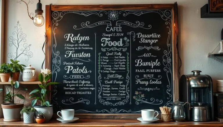
Photo: handwritten chalk menu board outside small British cafe, via ballenblogger.com
Somewhere in the last few years, something quietly flipped. The polished, pastel, 'aspirational lifestyle brand' look — all soft gradients and stock-photo handshakes — started to feel a bit... off. A bit like a hedge fund in a bucket hat. And in its place, a strange and wonderful thing has emerged: businesses that look like they were designed on a bus, and are absolutely thriving because of it.
Call it what you like — pound shop chic, austerity aesthetics, rave-flyer revival. I'd argue it's the most honest design movement Britain has produced in years, and small businesses should lean into it rather than apologise for their budgets.
Why Perfection Now Smells Like Marketing
Here's the uncomfortable truth for anyone who's spent a small fortune on brand guidelines: customers have developed a nose for polish. They know a template when they see one. They know the difference between a brand and a brand consultant's invoice.
A hand-drawn sign, a slightly wonky flyer, a menu board written in chalk marker that's clearly been amended with a biro — these things signal something expensive branding can't buy: there's a real person here, and they probably care more about the product than the packaging.
It's the same instinct that makes people trust the greasy spoon with the faded sign over the gastropub with the professionally shot smashed avocado. We've all been burned by beautiful.
The British Tradition of Doing It on the Cheap
Let's be clear — this isn't a new invention. It's a revival. Britain has always had a vernacular of brilliant low-budget design: the chippy menu with prices crossed out and rewritten, the local gig flyer photocopied to death, the village fete poster pinned to a lamppost with a staple and a prayer.
What's changed is that young brands have started treating this language as a deliberate choice rather than a compromise. You can see it in the DIY label design coming out of small breweries, the deliberately naff packaging on independent snack brands, the newsletters that look like they were knocked up in Word circa 2003 — on purpose. The joke lands because the product underneath is usually excellent.
That's the crucial bit. Low-fi works when it's a costume worn by quality, not a mask worn by corner-cutting.
The Trust Dividend
There's a practical argument here beyond aesthetics. When money is tight — and let's be honest, when is it not — customers are scrutinising where their cash goes. A brand that obviously hasn't spent a fortune on its look implicitly says: 'Your money isn't funding my rebrand. It's funding the product.'
For small businesses, that's not a limitation. It's a position. 'We're small, we're cheap-looking, and we're brilliant at the actual thing' is a message that lands particularly well right now, when everyone's suspicious of mark-ups and middlemen.
How to Do It Without Looking Lazy
A word of caution, because there's a fine line between charming and careless. If you're going to embrace the 99p identity, a few ground rules:
- Be deliberate. Wonky is a choice; inconsistent is a mess. Pick your lo-fi language — one typeface, one colour, one vibe — and commit.
- Sweat the details that matter. Spelling mistakes on a rave flyer are ironic. Spelling mistakes on your invoice are just mistakes.
- Let the product do the talking. The best budget brands look cheap and deliver premium. The worst look cheap and deliver cheap.
- Own it in your copy. Self-awareness is the difference between 'we couldn't afford a designer' and 'we spent the design budget on better ingredients'. One sounds like an excuse; the other sounds like a promise.
The 99p Point of View
We'd say this, wouldn't we — but we genuinely believe it. The best marketing was never about looking expensive. It was about being understood, remembered and trusted. If a photocopied flyer and a bit of personality get you there, you haven't undersold your brand. You've given it something a five-figure agency brief rarely delivers: a pulse.
So if your branding looks like it cost about a pound, stop apologising. There's never been a better time to be cheap and cheerful — provided, of course, that you're genuinely both.